
Windows Presentation Foundation (WPF) gives developers a lot of options to create flexible user interfaces with powerful controls and user friendly animations. It's no surprise that since 2010 Visual Studio heavily utilizes WPF for its UI. UserControls are the most common building block of a WPF application, but there is one less known and used option - implementing your own custom controls
Why Custom Controls?
- Custom Controls can be easily restructured using a custom ControlTemplate
- Custom Controls allow you to support different themes and styles
- Best approach when creating a library of reusable controls
Basic steps to define a Custom Control
In it's most basic form, creating a Custom Control requires:
- Defining a
StylewithControlTemplatein Themes/generic.xaml - Creating a class that derived from
Controland settingDefaultStyleKeyPropertyin the static constructor
Creating a Custom Control - Example
For this example, let's keep it simple and create a very basic form control with Label and TextBox
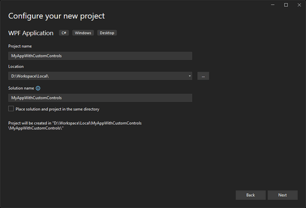
- Create a new WPF Application project
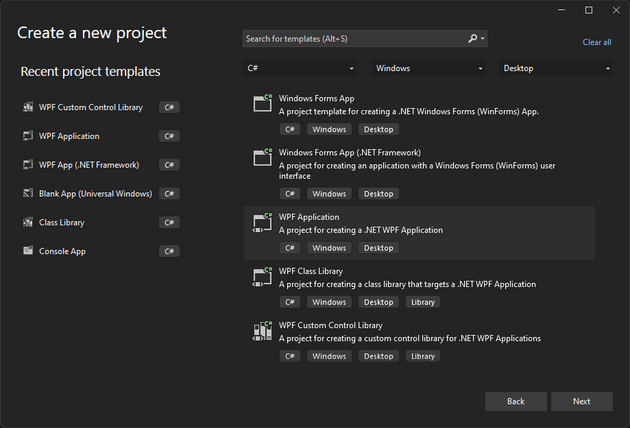
- Give it a name and select location
- Visual Studio will ask for Framework - at the time of writing .NET 7.0 is the latest version available in Visual Studio 2022
With the steps above we'll have our basic WPF application and we can move to the next step.
-
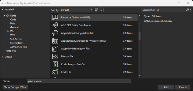
Add a folder called
Themesin the root folder of the application -
Inside Themes add a Resource Dictionary file named
generic.xaml
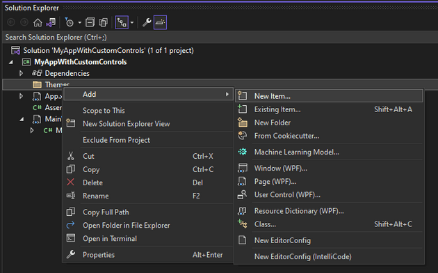
- Now let's create our Custom Control class
using System.Windows;
using System.Windows.Controls;

namespace MyAppWithCustomControls
{
    public class MyCustomControl : Control
    {
        static MyCustomControl()
        {
            DefaultStyleKeyProperty.OverrideMetadata(
                typeof(MyCustomControl),
                new FrameworkPropertyMetadata(typeof(MyCustomControl)));
        }
    }
}
and we need to define the Style for our new control
<ResourceDictionary xmlns="http://schemas.microsoft.com/winfx/2006/xaml/presentation"
                    xmlns:x="http://schemas.microsoft.com/winfx/2006/xaml"
                    xmlns:local="clr-namespace:MyAppWithCustomControls">
    <Style TargetType="{x:Type local:MyCustomControl}">
        <Setter Property="Template">
            <Setter.Value>
                <ControlTemplate TargetType="{x:Type local:MyCustomControl}">
                    <StackPanel>
                        <Label Content="MyLabel" />
                        <TextBox />
                    </StackPanel>
                </ControlTemplate>
            </Setter.Value>
        </Setter>
    </Style>
</ResourceDictionary>- Just for testing purposes we can add our new control to
MainWindow.xaml
<Window x:Class="MyAppWithCustomControls.MainWindow"
xmlns="http://schemas.microsoft.com/winfx/2006/xaml/presentation"
xmlns:x="http://schemas.microsoft.com/winfx/2006/xaml"
xmlns:d="http://schemas.microsoft.com/expression/blend/2008"
xmlns:mc="http://schemas.openxmlformats.org/markup-compatibility/2006"
xmlns:local="clr-namespace:MyAppWithCustomControls"
mc:Ignorable="d"
Title="My Custom Controls Test"
Width="400"
Height="250">
<Grid>
<local:MyCustomControl VerticalAlignment="Center"
HorizontalAlignment="Center"
MinWidth="200" />
</Grid>
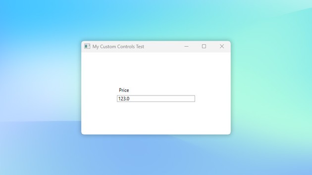
</Window>and after running the application we can see
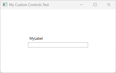
Now, admittedly this doesn't do much... To make the control more reusable we need to expose properties that will allow us to change the Label and the TextBox value.
- Adding Dependency Properties
In order to allow the consumers of the custom control to change the the Label and the TextBox value we can expose Dependency Properties. DependencyProperty is a special class in WPF which, among other things, enables data binding and animations/storyboards.
public class MyCustomControl : Control
{
    // ... constructor

    #region Label

    public string Label
    {
        get { return (string)GetValue(LabelProperty); }
        set { SetValue(LabelProperty, value); }
    }

    public static readonly DependencyProperty LabelProperty =
        DependencyProperty.Register(
            "Label",
            typeof(string),
            typeof(MyCustomControl),
            new PropertyMetadata("Label"));

    #endregion // Label

    #region Value

    public string Value
    {
        get { return (string)GetValue(ValueProperty); }
        set { SetValue(ValueProperty, value); }
    }

    public static readonly DependencyProperty ValueProperty =
        DependencyProperty.Register(
            "Value",
            typeof(string),
            typeof(MyCustomControl),
            null);

    #endregion // Value
}- Now we can update our MainWindow.xaml and apply custom values
<local:MyCustomControl VerticalAlignment="Center"
                        HorizontalAlignment="Center"
                        MinWidth="200"
                        Label="Price"
                        Value="123.0" />
Conclusion
In few simple steps we were able to create a Custom WPF Control that can be easily reused and restyles. In a future tutorial we will look into creating a WPF Control Library and using it in an application.